
WordPress is a CMS that allows you to easily create a showcase website or even an e-commerce site. However, having a website is no longer enough, it must also be modern and designed so that all users can consult it on all existing media (mobile, tablet, and computer).

Several plugins and WordPress themes are available to make a site adapted to all types of screens, but you still need to know how to choose them. Creating a responsive site may seem complex, but we are here to help you create your site successfully!
In this article, I will explain how to make your site responsive with WordPress by suggesting various solutions such as choosing a plugin or a particular theme.
What is a responsive website?
We often hear about responsive websites, but do you know what a “responsive” website is?
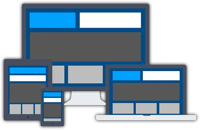
You use responsive websites every day without even knowing it since you consult websites on your computer, your tablet, or your smartphone. Responsive is a way to design a site, more precisely its design, so it adapts to all screen resolutions.
A responsive site is a website that can be viewed on any device such as a smartphone or a tablet that has different screen sizes than a computer. The display of the responsive site must be designed so that the navigation and consultation of the pages of the site are adaptable to all screen resolutions.
The content of a responsive site will be essentially the same if you consult it from a computer or a smartphone, only the layout will be adapted.
Why create a responsive site on WordPress?
The first reason why it is important to have a responsive site is to improve the user experience. Indeed, if you visit a website that is not responsive from a smartphone, you will often have a site that has a display too small.
Texts will be difficult to read without zooming in on them and there will be other elements that will be complicated to interact with.
The user experience is an essential factor to consider when creating a website since it is what will often determine if a visitor stays on your site for a long time or if he leaves it in a short time.
For example, a website designed without thinking about an optimal display on a smartphone can quickly become annoying, because it is too complicated to use on a smaller screen size than a computer.
Moreover, having an optimized user experience and a responsive site are criteria increasingly taken into account by search engines, including Google, in the natural referencing of websites.
A responsive site will therefore have more chances to be better positioned than a site that is not responsive on one of the same criteria.
WordPress is a good choice to create a responsive site because there are many themes already designed with a responsive display. All you have to do is design your WordPress site with one of these themes to create a responsive site easily. If you already have a WordPress site, but it is not responsive, you still have the option of making your site responsive with page builder extensions.
Related Post: How To Install And Use Beaver Builder On WordPress
How to make your site responsive with WordPress?
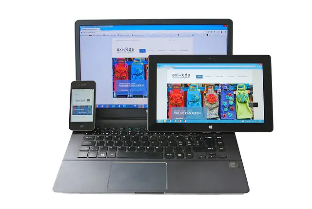
Mobile users are more and more numerous and the smartphone is becoming the most used device to browse the internet. Therefore, it is imperative that your site be mobile-friendly.
If you are just starting to create your website or if you already have a website on WordPress, you will find all the tools on this CMS to create an efficient responsive website.
The first solution to create a responsive site on WordPress is to use a theme that offers design elements designed to adapt to all screen resolutions. The second option you have is to use a plugin that will allow you to make your site responsive.
Thanks to the theme, the modules you can use will already be designed to be responsive, you will only have to make a few adjustments to make your site responsive. The choice of the theme is therefore the most important since you will have to be satisfied with the design it offers.
Using an extension to make your site responsive gives you greater possibilities because you can configure the display of each element on several screen resolutions.
Related Post: Google Ste Kit: Install Google Tools On WordPress
What are the best responsive WordPress themes?
A WordPress theme is the heart of your website’s design. It will determine the look and feel of your website and therefore the look and feel of your entire website.
When choosing a theme, it is important to look at the design elements that the theme offers through a demo of the theme for example.
But the design is not everything and that the site is responsive is also important to facilitate navigation on the site with a smartphone. In order to meet these two essential criteria for a website, a good responsive design, we have selected for you 5 themes that will allow you to create a beautiful site with an optimal user experience.
There are of course many other WordPress themes that are excellent in their field. So, if you find a theme that doesn’t appear in this list, but you like, don’t hesitate to check the demo of this theme to make sure it is responsive before buying it.
Without further ado, here are the themes that caught my attention to create a responsive site on WordPress.
Related Post: How To Create A Form With Contac Form 7 On WordPress
1. Divi Theme

Divi is not just a theme. If you buy the theme from the designer ElegantThemes, it will come with the page builder of the same name. Indeed, many people know Divi for its page builder which is very complete and convenient to create a site with a wide range of customizable options, but its theme is just as powerful.
The Divi theme is fully responsive and adapts perfectly to all devices. As a bonus, you’ll have access to a large library of page templates and elements that you can import directly into your site.
These templates will allow you to create your site even faster, as you will only have to customize design elements already designed by the Divi team.
As for the page builder, it provides you with many options to modify your site as you wish, including the management of the responsive, but we will talk about it later in this article.
2. Astra Theme
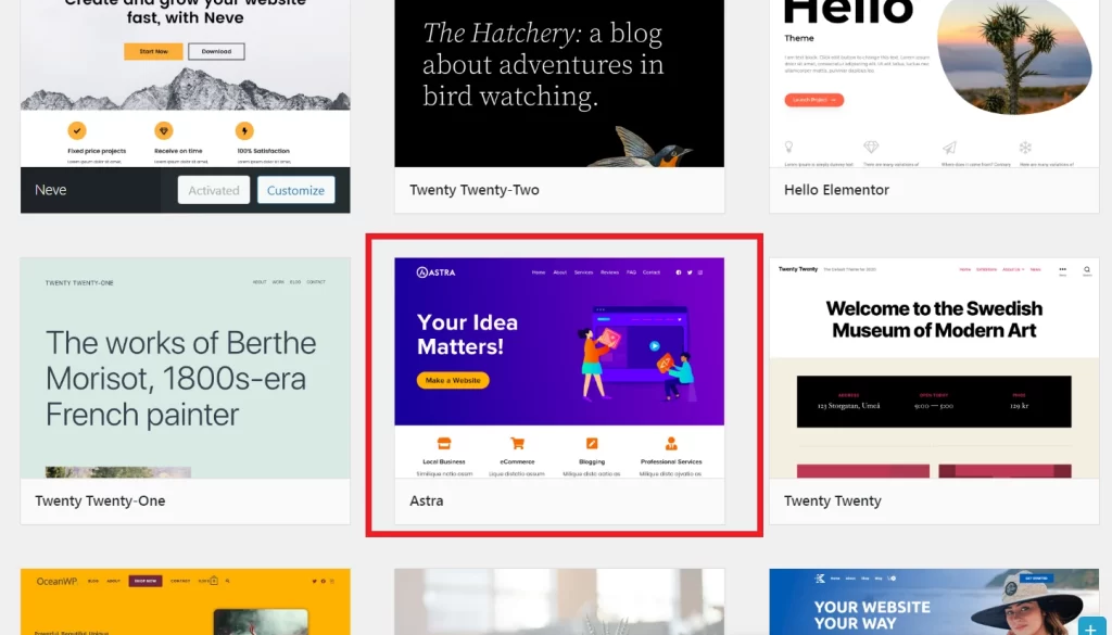
Just as well known as the previous theme, Astra is a complete theme that can be suitable for any type of site. Whether you have a showcase site or an e-commerce site in any field of activity, you can create it with the Astra theme.
This responsive theme is meant to be light and flexible so you can quickly design a website without having to touch a single line of code. It comes with many customization options, including some dedicated to the management of the site header which will be very useful to display a header adapted to mobile use.
3. OceanWP Theme
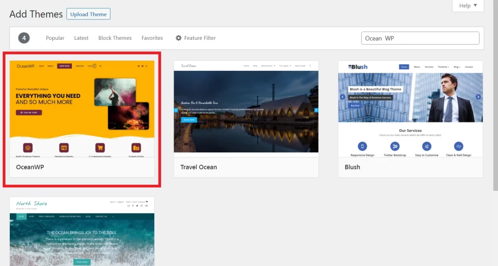
Coming with a lot of features, the OceanWP theme is an ideal tool to create any kind of site. With OceanWP, you will be able to create a site with a clean and effective design on all screen sizes.
One of the special features of this theme is that it is very light and offers good performance when loading the pages of the site. This is a good point for the user experience and the SEO criteria imposed by search engines.
4. Authority Pro Theme
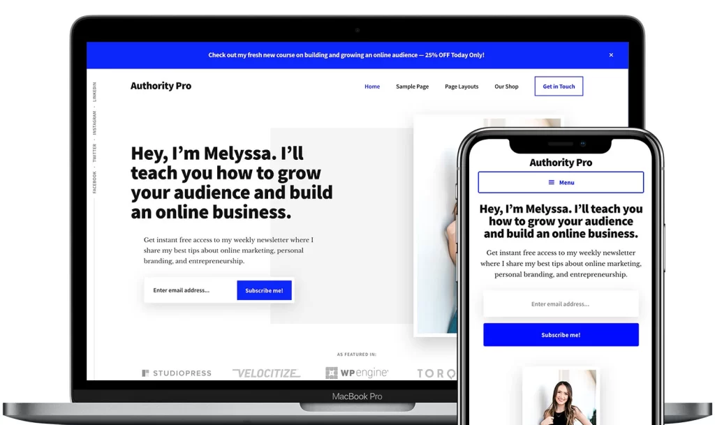
The Authority Pro theme is designed to showcase the skills of a personality. Although you can create any site with it, it is a theme dedicated to selling online training and courses.
Authority Pro is free but can be purchased with it to take advantage of the “Genesis Pro” page builder designed by StudioPress which is also behind the theme. Genesis Pro will give you more possibilities in customizing the Authority Pro theme, but also in managing your website.
5. Ultra Theme
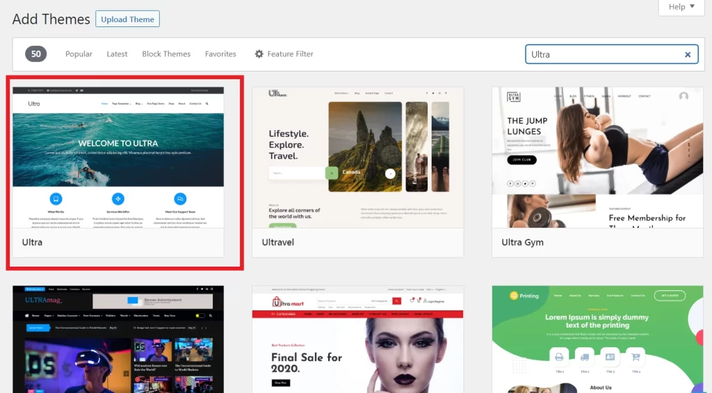
Ultra is a generalist theme that is not intended for any particular type of site. With this theme and its drag-and-drop functionality, you can easily create a responsive site in just a few clicks thanks to several site templates that you can import at any time.
You will find with this theme many features like a counter, Google Maps integration, and several types of carousels or animations.
Related Post: 5 Tips To Increase Your Visibility On The Web
Which plugins to choose for a responsive WordPress site?
Choosing a good theme is essential to having a beautiful responsive site, however, sometimes the theme you use will not have all the design elements or display customization you would like to have.
In this case and also when a theme is not responsive by default, it is possible to use a WordPress plugin that will offer you more features than a theme can ever offer.
I already talked about these plugins earlier in this article, they are the page builders that allow you to create almost 100% customizable sites. But there is also another type of plugin that I will present to you that will allow you to add display options to make your site responsive.
Let’s start with the presentation of the most popular page builders on WordPress.
The best page builders on WordPress
Page builders are plugins to install on your WordPress that allow you to design more complex websites than with the Gutenberg editor offered by default on WordPress.
The main advantage of these builders is that you will be able to make all these changes without having to touch a single line of code, which is ideal for beginners in site creation and those allergic to code.
At the moment, there are several page builders fighting for the top spot of the best page builder on WordPress. But without a doubt, if you’re looking for a builder that offers you maximum functionality and freedom to create your responsive site, you’ll have to turn to one of these 5-page builders:
- Divi Builder
- Elementor Pro
- Beaver Builder
- Oxygen Builder
- Bricks Builder
On each of these page builders, you will be able to set the display of each element of your site according to different screen resolutions. This way, you will have full control over the responsive side of your WordPress site.
While there is no real “best” builder among the ones suggested above, some might suit you more than others. Thus:
- If you’re looking for a big page builder with lots of pre-built add-ons, then the “Divi” and “Elementor” builders will be perfect for you.
- If you prefer a lighter and easier-to-use builder, but with almost as many features as the others, then “Beaver” will be your ideal choice.
- And finally, if you want to have complete control over the creation of your site, even to the point of creating new components yourself by adding a few lines of code, then the page builders “Oxygen” and “Bricks” will be the best choice!
WPTouch Pro, the plugin to make your WordPress responsive
Finally, one of the last possibilities you have to make your WordPress site responsive is to use a plugin like “WPTouch Pro”. Specifically, WP Touch Pro will modify the behavior of your site when your visitors come to browse your WordPress site from a mobile device.
The plugin will offer your users a fully responsive theme when they are on a smartphone, even if your base theme is not designed to be adapted to other screen sizes than a computer.
WPTouch Pro even offers several options to display different elements of the “Computer” version to your “Smartphone” visitors. If you don’t want to use a responsive theme or don’t want to completely redesign your WordPress site with a page builder, then the WPTouch Pro plugin is your ultimate solution!
My tip for creating a responsive site with WordPress
If your WordPress site is not yet responsive, you can choose one of the solutions proposed in this article to quickly adapt your site to all devices. Making your site responsive is essential so that all your users can view your site without difficulty.
However, you may need to completely redesign your website to make it responsive, which is a big project that requires several skills. In this case, don’t hesitate to quickly find a freelance WordPress developer who can help you make your WordPress site responsive.